
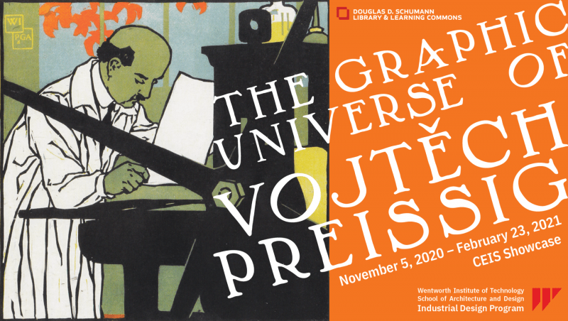
CEIS Showcase Exhibit – November 5, 2020 – August 31, 2021
Vojtěch Preissig was an important figure in the early years of Wentworth Institute of Technology. Director of the School of Printing and Graphic Arts at Wentworth 100 years ago, from 1916 to 1924, he was an influential typographer, printmaker, designer, illustrator, painter and teacher. Born in Czechoslovakia, he came to the United States in 1910 and taught at the Art Students League and Columbia University in New York, before arriving in Boston in 1916 to assume his post at Wentworth. Here he taught typesetting, art history, layout and composition, color theory and several other fundamental design concepts that are still current in the visual design courses of the Industrial Design program.
Preissig’s own work evolved from the more curvilinear Art Nouveau Style (soft, feminine) of the 1910s to political, military imagery (raw, masculine) by the 1930s, characterized by strong dynamic lines, a deep color palette, high contrast compositions, abstract backgrounds and dramatic body postures.
After Preissig’s tenure at Wentworth and a prolific career in America, he returned to Prague in 1931. In 1939 he joined the anti-Nazi resistance and published the illegal magazine V BOJ [In the fight] together with one of his daughters, the journalist Inka Bernášková. They were both captured in 1940 and Preissig and Inka died at the hands of the Nazi, she in 1942 and he in 1944, Preissig was 70 years old.
Industrial Design students in courses such as Visual Communication and Information Architecture were challenged to create new works related to the fundamental and universal design principles used by Preissig, applying these concepts in contemporary visual language.
A comparison of Preissig’s work of the early twentieth century with the student work shown here of the twenty-first century hopefully illustrates the continuity of the foundational design principles of contrast, balance and hierarchy — even as creative design and printing technologies have evolved over the last one hundred years.
This exhibit is the result of a collaboration between the Industrial Design Program and the staff of the Schumann Library. The use of the original Preissig material from the Archives was fundamental in the research and design of the exhibition.
Exhibit Research and Design – Carlos Vilamil, Industrial Design Program
With Special Thanks to:
Rhonda Postrel – Schumann Library
Pia Romano – Schumann Library
Kevin Kidd – Schumann Library
Sam Montague – Industrial Design Program
Bibliography:
Preissig, Vojtěch, Richard Kegler, and Timothy Conroy. Dear Mr. Hunter: The Letters of Vojtěch Preissig to Dard Hunter, 1920-1925; [Editors, Richard Kegler, Timothy Conroy] P22 Editions, 2000.
Vlčková, Lucie and Branislava Kuburović. Vojtěch Preissig. 1st ed. ed. Arbor vitae, 2012.
Read the TEXT ON ALL THE EXHIBIT PANELS
INTRODUCTION
The idea to create this exhibition was born in early 2019 when I visited the recently opened graphic design-oriented Katherine Small Gallery in Somerville, MA. I was chatting with the founder Michael Russem and he asked me if I was aware that a famous Czech artist used to teach at Wentworth in the early XX century. I had no idea about it and after that encounter I became interested in finding out more about this part of Wentworth’s history.
The artist in mention was Vojtěch Preissig, a Czech typographer, printmaker, designer, illustrator, painter and teacher who directed the School of Printing and Graphic Arts at Wentworth from 1916 to 1924. The goal of this exhibit is to share Preissig’s story, some of his most relevant work, and highlight the strong historical connection that Wentworth has with the graphic arts, from when the discipline was taught as a Two-Year Day Course to the current visual design content included in several courses of the Industrial Design program.
This exhibit also wants to share with the Wentworth community the graphic work that Industrial Design students currently create, how it is related to fundamental, universal and timeless design principles like those used by Preissig and how they are applied in contemporary visual language.
The first part of the exhibition focuses on the history and work of Vojtěch Preissig, from his early career in Europe and New York to his later propaganda pieces for the American government during WWI. The last part of the exhibition showcases some of the best student work from the Summer 2020 Advanced Graphic Design course, a junior level elective course I designed for the Industrial Design program that was also offered to Interior Design students.
The Advanced Graphic Design course built upon the concepts and skills acquired in previous courses like Visual Communication, Color and Composition and Information Architecture and challenged students to go deeper into more elaborated and complex graphic design projects. Storytelling was emphasized in every exercise and questions like “What is the feeling you want to convey with your composition?” or “How do you want the eye to read your design?” were often asked during reviews. Project length ranged between 2.5 and 4 weeks and abundant hand sketching was required before any project became digital to encourage quick and broad idea exploration free from the technical limitations with the software, in this case Adobe Illustrator and Photoshop. Once sketches were translated into digital drafts new and more advanced software techniques and workflows were introduced and digital craft, accuracy and attention to detail were stressed.
This exhibition is a humble homage to an inspiring artist, teacher, and committed activist that a 100 years ago taught and walked around these very same halls we walk today at Wentworth.
– Carlos Villamil
The text on this exhibition was set using Wentworth’s official typeface, IBM Plex Sans, designed by Mike Abbink, Paul van der Laan, and Pieter van Rosmalen in 2017. IBM Plex Sans is a grotesque typeface with a balance of natural and engineered letterforms that remain technical and precise without losing the humanist quality of the text.
1900s Art Nouveau
Preissig’s early XX century work was highly influenced by the spirit of the time and features some of the main characteristics of the Art Nouveau movement aesthetics. Pastel color palettes, fluid organic lines, floral and animal motifs and feminine subjects were part of his visual language. During the 1900s he created a variety of commercial art pieces and briefly worked in Paris, at the studio of fellow countryman Alphonse Mucha, one of the most famous European commercial artists of that period.
1910s Working in USA
Preissig arrived to New York in 1910 after trying for some years to run his own studio in Prague unsuccessfully. Initially, he worked in several printing and design companies as advertising designer and typographer and became familiar with American printing technology. Later on he led graphic arts courses at the Art Students League of New York and the prestigious Teachers College of Columbia University before moving to Boston in 1916.
Throughout his life Preissig designed several typefaces and also edited existing western alphabets to include Czech accents. In the words of Richard Kegler, founder of P22 type foundry who have updated and published digital fonts based on Preissig’s designs: “These alphabets show a great affinity for hand-craftsmanship without appearing too clean and combine bold experimentation with a high degree of legibility.”
1916–1924 Wentworth
Preissig was a typography expert and this subject was one of the courses in the Printing and Graphic Arts main programs. Students also learned about art history, layout and composition, color theory and several other fundamental design concepts that are still current in the visual design courses of the Industrial Design program.
At the time, all printed material of the Institute was designed and printed in-house. The Printing and Graphic Arts shops also produced abundant work for external partners and the government.
The captions of these images in the Institutes’ 1917–1918 catalogue are carefully crafted and describe in few words the skills acquired in several courses of the Printing and Graphic Arts program. The department also offered special courses in block printing and etching and part-time courses for apprentices.
1930s Activism
These designs are economical, simplified to reduce cost and printing time. But simple yet effective designs require mastery and Preissig used clever strategies to achieve impact with limited elements.
His work from this period is characterized by strong dynamic lines, a deep color palette, high contrast compositions, abstract backgrounds and dramatic body postures.
During WWI Preissig was heavily invested in the war effort against the Central Powers. His Wentworth tenure became the environment where he designed and produced a variety of military propaganda posters, postcards and other materials inviting Czech-Americans and the general public to enroll in the American military corps to fight in Europe. His home in Jamaica Plain was also a regular gathering place for political meetings.
He was also very excited and optimistic about the new political situation in his home country after the war. The recently created Republic of Czechoslovakia was the only democracy in Central Europe during the inter-war period.
At the time Preissig was one of the highest profile Czech artist in his field in the world and in the summer of 1920 he went to Prague, with his wife and three daughters, via an official invitation by the Czech government. He was offered a high academic position and the direction of a new graphic arts program and was seriously contemplating the idea to return to Europe. The offers didn’t come through and with the academic year starting at Wentworth they decided to return to Boston after just two months in Prague.
A little over 10 years later, in 1931 he returned to Prague definitively after a long and prolific career in America. Starting with his arrival to New York in 1910, he then moved to Boston and back to New York before returning to Europe for good. This 21-year period was a very important part of Preissig’s life.
In 1939 he joined the anti-Nazi resistance and published the illegal magazine V BOJ [In the fight] together with one of his daughters, the journalist Inka Bernášková. They were both captured in 1940 and Preissig and Inka died at the hands of the Nazi, she in 1942 and he in 1944, Preissig was 70 years old.
Preissig’s life is a fascinating story worth remembering. He was a citizen of the world, a family man, an educator, an immigrant and overall, a talented artist with a sensitive soul and strong political will.
He is still with us and walks around the Wentworth campus, this time in the form of timeless visual design principles populating the young mind of our students.
Note: The text on this exhibition was set using Wentworth’s official typeface, IBM Plex Sans, designed by Mike Abbink, Paul van der Laan, and Pieter van Rosmalen in 2017. IBM Plex Sans is a grotesque typeface with a balance of natural and engineered letterforms that remain technical and precise without losing the humanist quality of the text.
View the Preissig and Wentworth student images in the show (hover over images for more details):


Take a look at the news story about the show that appeared on the Wentworth website.
For questions about this exhibit or to propose an exhibit, contact libraryexhibits@wit.edu.